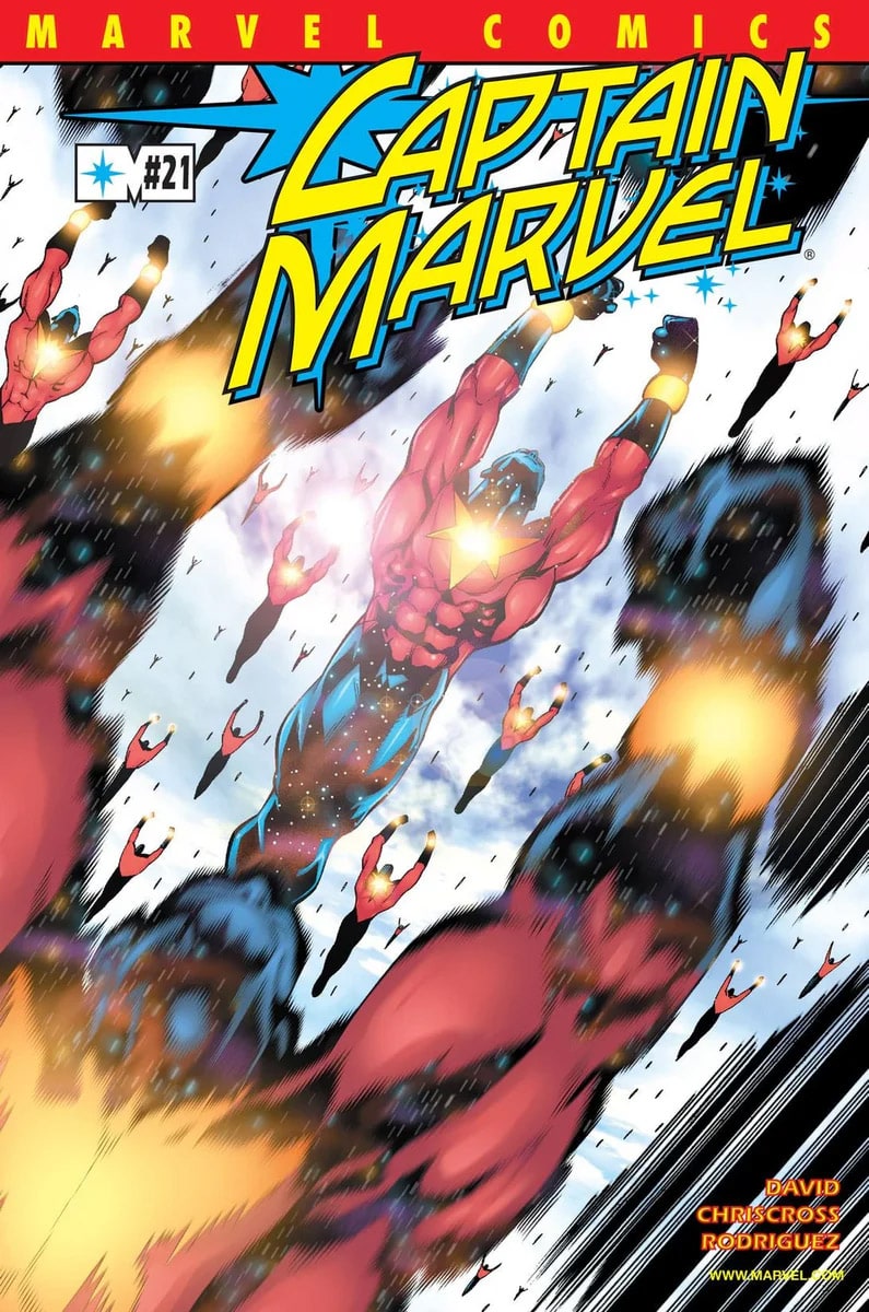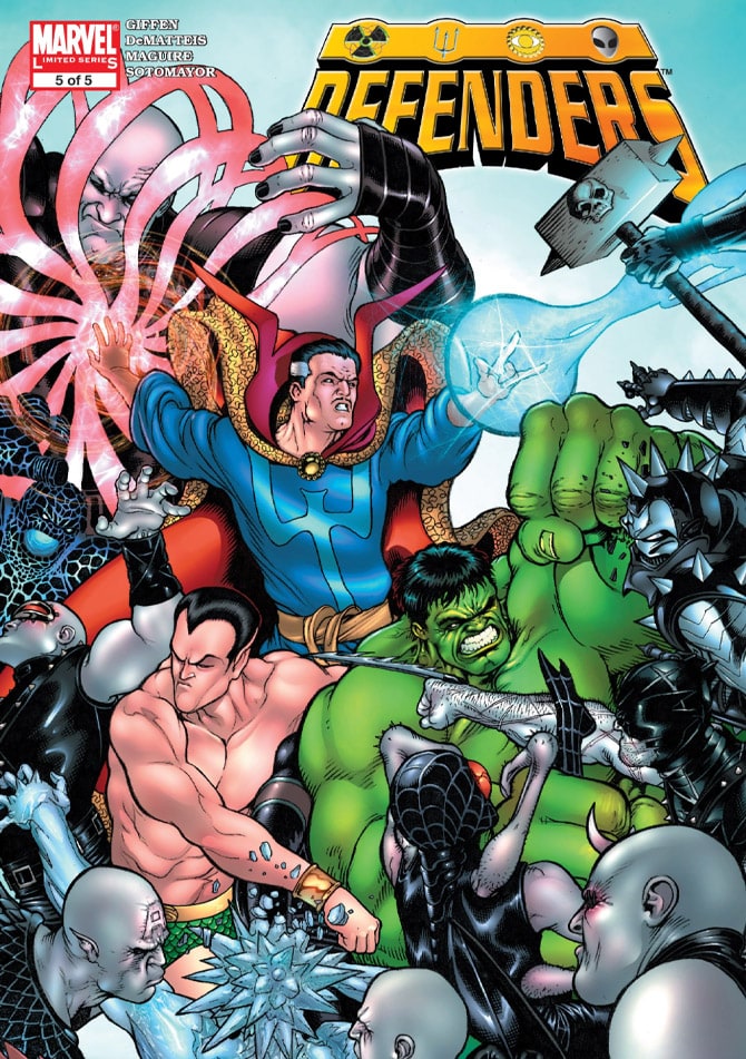
Two weeks ago, I talked about how Tom Brevoort was a mentor of mine. This week we’re going to talk about another one–Chris Sotomayor. And I’m so pleased that Soto and I met in 2002 and are still working together to this day.
As an editor of comics, part of your job is to understand how comics are made, but more importantly, be able to evaluate each step in the process with a discerning eye. I had studied story for a long time and specifically visual storytelling. Out of the gate as a young editor, I was pretty good with scripts and penciled art–looking for strong storytelling, but I struggled a lot with evaluating inking and coloring in comics.
I could see that inks were on the page and the same with color. But one night, over a few drinks with friends, Soto had come into the city and joined us. As it happened, I wound up sitting at a table just the two of us. Soto was already well established in the comics industry as one of the top color artists. And we’d been working together on a couple of books and grown to like one another.
Now, I had already been observing notes coming out of my editorial office, usually from the awesome Marc Sumerak, to color artists asking for adjustments on first drafts. I learned from Marc that note should be specific, and as surgical as possible. But what I was having trouble evaluating was the approach or the thinking of the coloring.
So, here we are, two comics people over a couple of beers, and I asked him about coloring. How did he approach each page or each project. Did he group whole scenes together or did looks at one panel at a time? And how, as an editor, could I help him and other color artists, make their work stronger.

I had already gotten down the costume colors (Captain America’s center stripe is always supposed to be red, just so you know). I could get that, but what else should I be looking for?
Soto broke it down to me that night. We talked about color palette, making the choices of what color tones were going to help bring out the emotional center of the piece or the scene. He talked with me a lot about lighting. How to look for it in pencils and inks, and how the color artist should follow their lead. We talked about color temperature and of course, color theme.
I wished I had a notepad with me at the time, but I didn’t. I was hanging on his every word. I’m kind of a nerd like that, I guess. This was a Friday night. But I couldn’t wait until Monday to go back into the office and start looking at colored pages again.
Saturday morning, I fired up my home computer and logged into my work email account. I downloaded several first draft color pages and started looking at them. They looked entirely different to me. I started looking at the color temperatures, the palette choices, how the color artist dealt with lighting, how the coloring separated the planes and enhanced the story telling, choices the color artist would make to smoothly move the reader’s eye–all while complimenting the art that they were working off of.
But I also started to notice when those things weren’t happening the way they could–ways they could be improved, opportunities missed, perhaps. I honestly felt like up to that point I had been color blind and now I just entered the wonderful world of the wizard of Oz. It was crazy how that one conversation opened my eyes and brain up to taking in color in a whole new way–looking beyond was that the correct color and looking at the “why” of the coloring choices.
Soto knows his stuff. And he’s a heck of a teacher, too. That’s why I’m so pleased to announce that Soto teaches Comics Experience’s coloring courses for comics–and this week only, we’ve got a spotlight sale on them. If you want to learn to color comics from the best, now’s your chance. The sale ends this weekend, so don’t delay!
And that’s my two staples worth….

